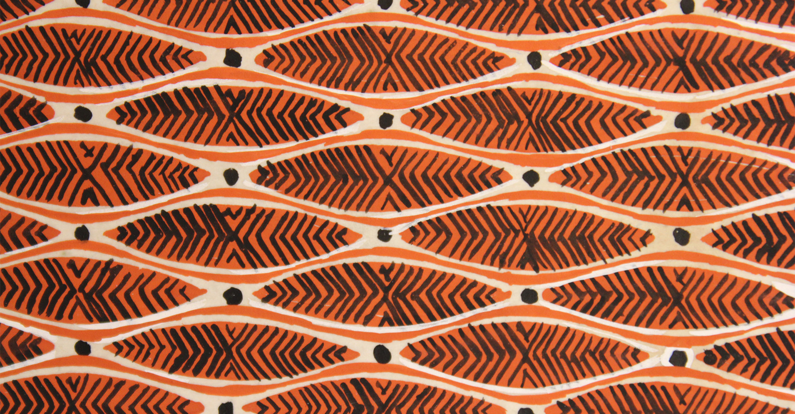
Ditchling Museum of Art + Design Residency
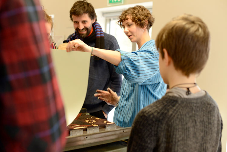
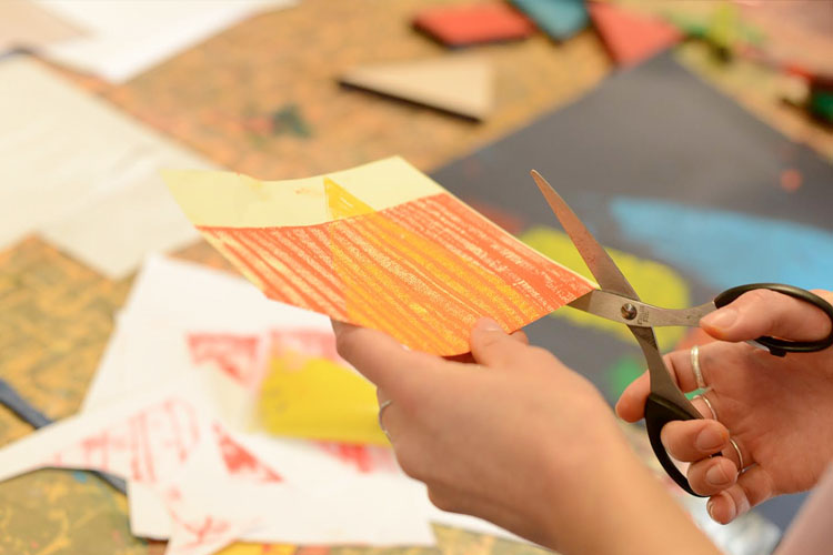
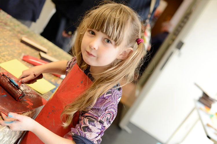
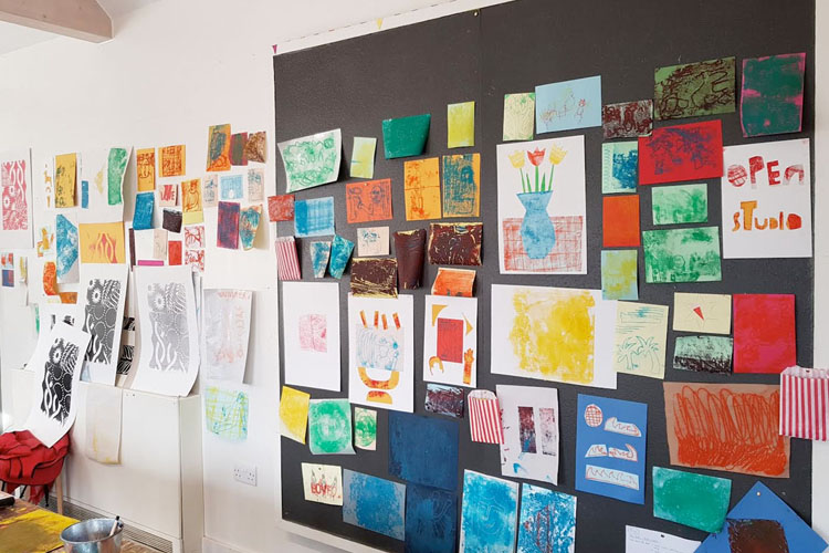
We had the fantastic opportunity of working at the Ditchling Museum of Art + Craft on a series of residencies involving students and staff from the Illustration and Graphic Design courses at the University of Brighton. The last one concluded on the April 29th 2018, and the workshop format residencies ran for four months on the last Sunday of every month, from 11-4pm.
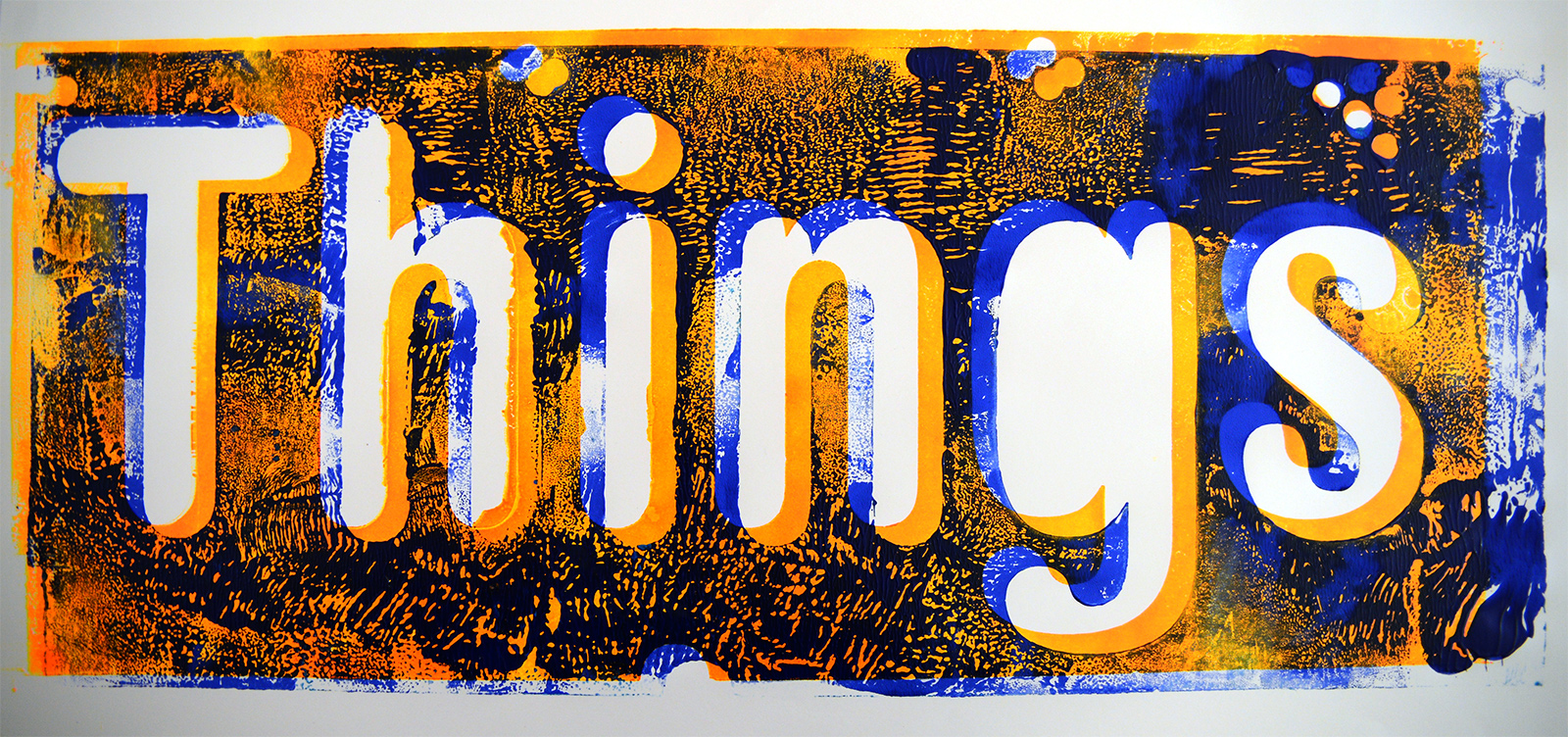
Two main types of printing were explored, letterpress and collograph - both using pre made, or found objects, as with the 'Things' print shown below that uses a printing block made from a discarded laser cut found at the University. It would have originally been cut to create the letterforms, but the resulting form creates an instant printing opportunity. A series of these 'Waste Prints' were created and we intend pursuing this approach to printing further, primarily as it allows a great deal of chance to come into the creative process, with the designer relinquishing design 'choices' in favour of the accidental, the unexpected and chance. As the American author and entrepreneur Emanuel 'Jim' Rohn said:
"If you are not willing to risk the unusual, you will have to settle for the ordinary."
However, caution must be taken with the notion that chance alone is the answer to unravelling the creative process, it isn't. A counter argument can be found in the worlds of Abigail Adams, First Lady to John Adams (first Vice President of the United States, 1789-97 and second President of the United States, 1797-1801), where she rightly identifies the need for rigour as a companion to abandonment of rules and conventions.
"Learning is not attained by chance, it must be sought for with ardor and diligence."
Printing offers these seeming contradictions in the way it works. By it's nature it has to be exact. Is something isn't exactly type height (the height a printing block needs to be for the ink to reach the paper) it simply won’t print. If it is not high enough, even by a millimetre or so, nothing will print. Equally, if it is too high, the machine will jam. There is simply no room for manoeuvre or error. Printing is also by its nature, very inexact. The way ink reacts to the paper changes every time you print, the ambient temperature, the pressure and the materials all introduce a sense of difference and 'controlled' uncontrollability.
The workshops had several hundred people using the Clore Teaching space at the museum over the four month period and it was wonderful to see the reactions of people, young and old, into the arts and novices, as they print. There is something magical about the ‘reveal’, as you pull the paper back to a successful print or dramatic fail, but perhaps that isn't important, it is the taking part in the often slow process that is perhaps more relevant in our increasingly busy lives - a time for disaster perhaps? As Rudyard Kipling said in his poem 'If' (circa 1895)
"If you can meet with Triumph and Disaster. And treat those two impostors just the same"
The residencies were organised by Ditchling Museum of Art + Design with Gavin Ambrose and Beth Salter of Studio 245 and students of the Illustration and Graphic Design courses at the University of Brighton and ran on the 28th January, 25th February, 25th March and 29th April 2018.
Elizabeth Friedlander
The design work of Elizabeth Friedlander is largely unrecognized, which is surprising given her prolific career from the 1920s onwards. Ditchling Museum of Art + Craft’s exhibition on Friedlander, co-curated by artist and author Katharine Meynell (the grand-daughter of Francis Meynell), presents a story of struggle, persecution and perseverance.
Friedlander’s career charts cultural and political history. Born in 1903, to wealthy and culturally aware Jewish parents, she was forced to flee Nazi Germany in 1936, originally hoping to move to New York, America where the Bauer Foundry head office was located, but ultimately only getting as far as the UK. She became friends with the poet and printer, Francis Meynell, who found work for the young designer and by 1942, in the height of World War Two, Friedlander was head of design at Ellic Howe's black propaganda unit using her design talents to produce materials intended for influencing opinions on the current conflicts in Europe.
Jan Tschicold’s 1950s re-workings of the Penguin series, the so-called ‘Modern Classics’, have received universal press coverage and design accolades. However, Friedlander’s post-war designs remain in comparison obscure and unrecognized. This isn’t to take away from Tschicold’s vision and uncompromising modernist design principles, but it does highlight an inequality in the celebration of the designer as ‘man’, as opposed to designer as ‘woman’. In part this may be to do with the subtlety of Friedlander’s work, rooted in craft, which is arguably less brash and immediate than Tschicold’s work for Penguin that reflected the modernist, optimistic, post-war zeitgeist. Arguably, Friedlander’s Penguin designs reflect a time in need of peace, reflection and contemplation. In contrast, Tschicold’s designs speak of a modernist future, the post-war European Project and a universal proposition of design.
A look through any compendium or anthology of Graphic Design history makes it clear by omission, that Friedlander isn’t recognized or credited with any role in the development of the profession, or indeed the role of the female in a predominantly male environment.
Arguably, Friedlander’s story (and this exhibition) is as relevant today as it was 60 years ago in the depths of world conflict. 2018 looks set to be dominated by continuing struggles and conflicts of faith and will be remembered as the year women’s rights and pay inequalities were highlighted to the world. The subtle beauty of craft and impassioned design Friedlander exemplifies are a reminder that the struggle for peace and equality is an ongoing one – and a fight that will be won with persistence, courage and conviction.
